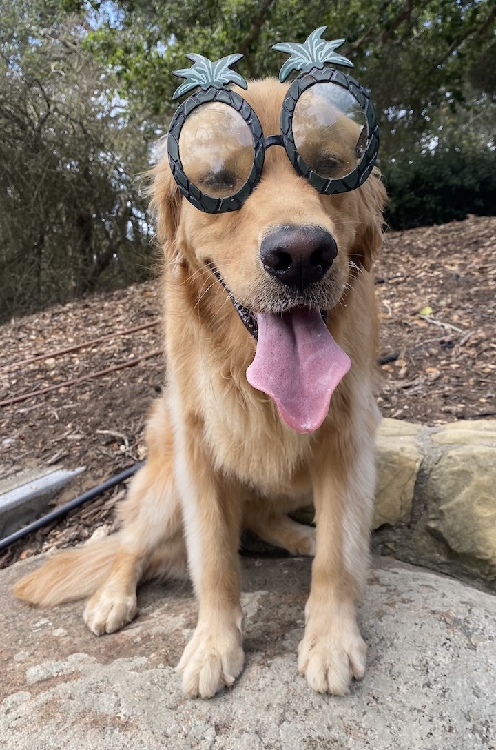
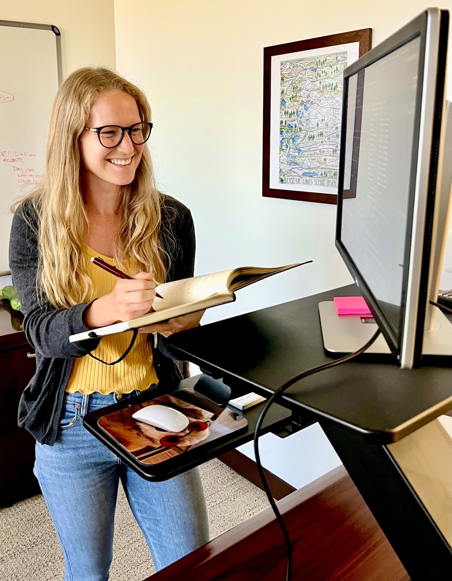
 Hi, I’m Haley. I’m a Data Scientist at the National Center for Ecological Analysis and Synthesis (NCEAS) located at UC Santa Barbara. Currently, I’m collaborating with an interdisciplinary team working to understand the environmental justice implications of global food trade. More broadly, I am interested in leveraging data to understand patterns and answer questions. I work towards achieving these objectives through data wrangling, statistical analyses, and data visualization primarily in the programming language R. In my spare time, you can find me at the beach running around with my dog Moose (she’s from Alaska). The beach is her favorite place and who could say no to that adorable face?

- Data Scientist | National Center for Ecological Analysis and Synthesis | 2022 - present
- Research Assistant | Oregon Department of Fish and Wildlife | 2015 - 2017 & 2019 - 2022
- Program Assistant | Oregon Sea Grant | 2015 - 2017
Select Publications
- Fox, H.K., Swearingen, T.C., Molina, A.C., 2022. An interrupted time series approach to assess Marine
Protected Area impacts on recreational fishing license sales. Aquatic Conservation Marine and Freshwater
Ecosystems. (Article link)
- Fox, H.K., Swearingen, T.C., Molina, A.C., Kennedy, C.M. 2022. Oregon recreational fishers’ knowledge,
support, and perceived impacts of marine reserves. Ocean and Coastal Management 225:106241. (Article link)
- Fox, H.K., Swearingen, T.C., 2021. Using a difference-in-differences and synthetic control approach to
investigate the socioeconomic impacts of Oregon’s marine reserves. Ocean and Coastal Management
215:105965. (Article link)
Tutorials

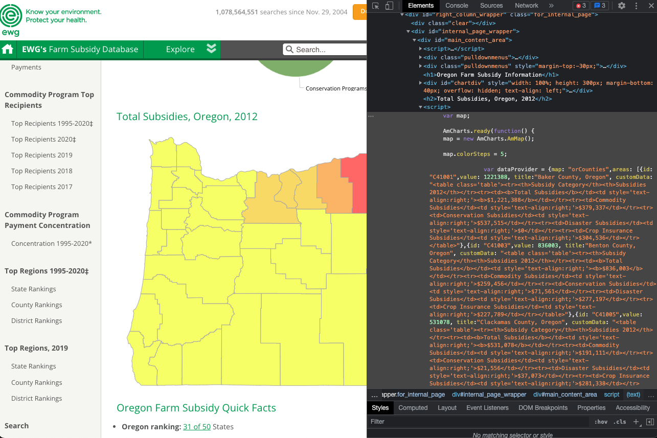
- A tutorial on web scraping data (US agricultural subsidies) from interactive maps using the {rvest} and {usmap} packages.

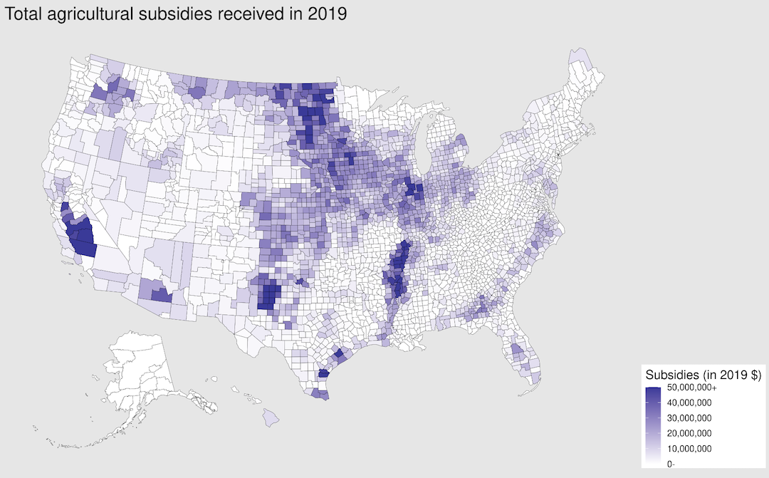
- A tutorial on creating animated maps of agricultural subsidies in US counties using the {usmap} and {gganimate} packages.

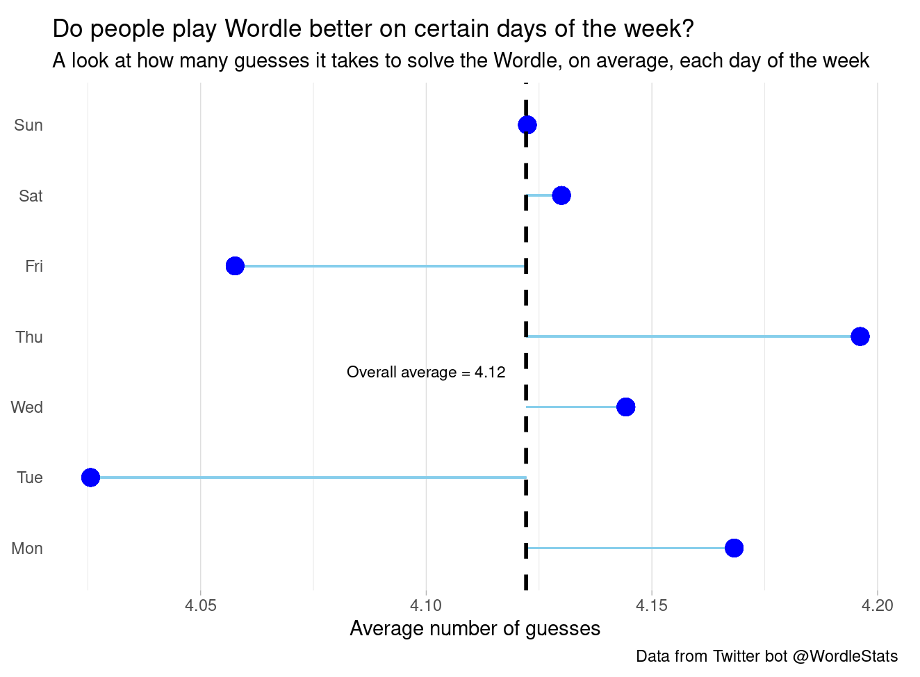
- A tutorial on scraping data from websites using {rvest}, downloading tweets using the Twitter API and {rtweet}, and visualizing Wordle-related data using a scatterplot, lollipop chart, word cloud, and stacked barplot.

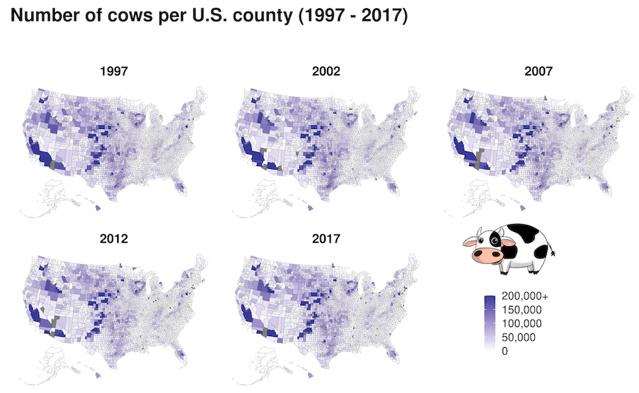
- A tutorial on mapping changes in the number of cows in U.S. counties over time, adding an image to a plot, and using {facet_wrap} to plot multiple maps.
Shiny

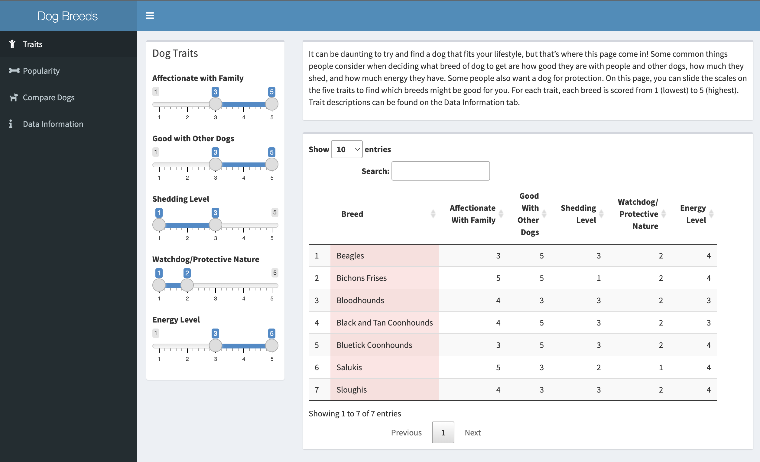
- Code for an interactive shiny dashboard looking at dog breeds, traits, and poularity. This dashboard can be useful for people considering getting a dog and wanting to find out more about specific breed's traits and which breed might best suit their lifestyle.
Data Visualizations

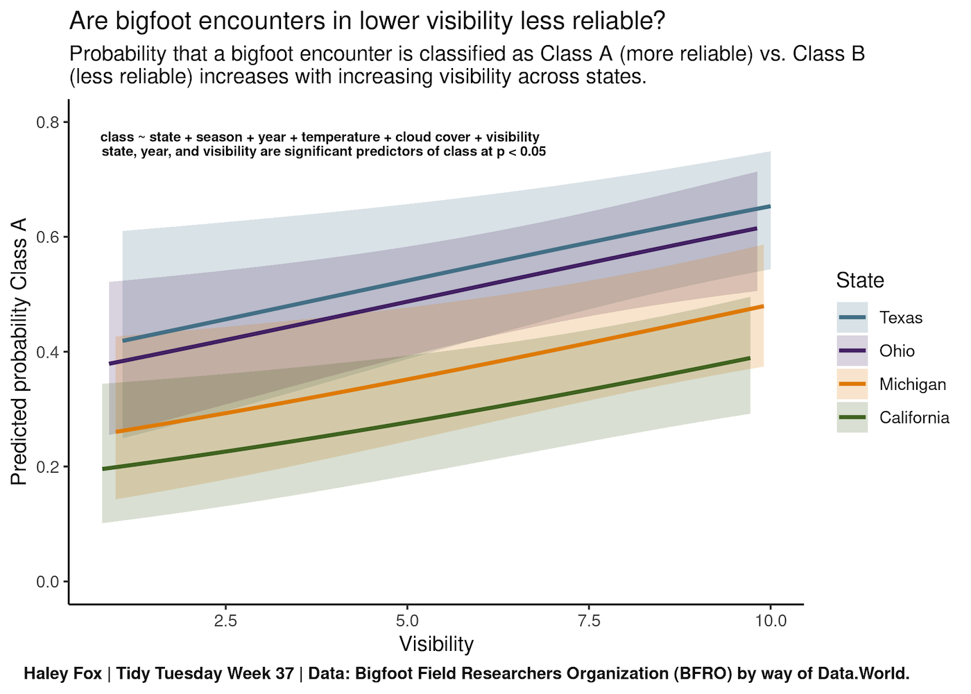
- Code to run a logistic regression for bigfoot encounter classifications and plot predicted probabilities and 95% CI of significant predictor variables.

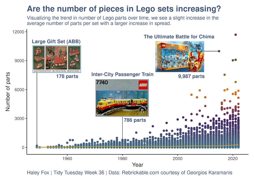
- Tidy Tuesday code to create a scatterplot showing the number of pieces in Lego sets over time using the {PrettyCols} package.

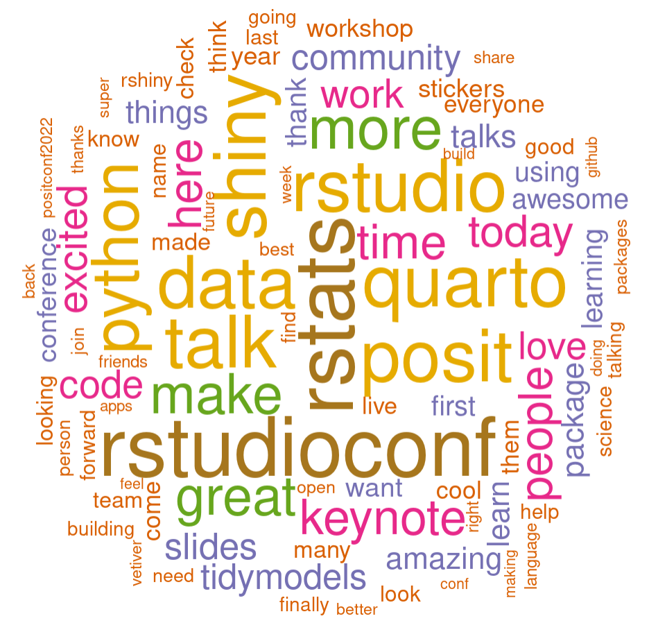
- Code on interacting with the Twitter API using {rtweet} to scrape tweets with #Rstudioconf2022 and making a wordcloud with {wordcloud}.

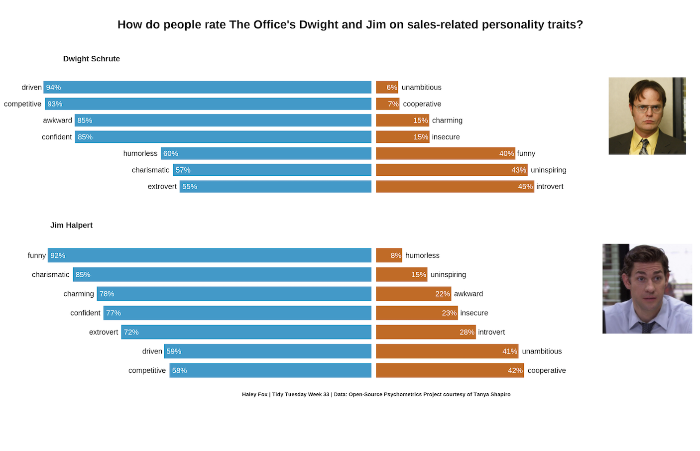
- Tidy Tuesday code to create a plot of character traits from members of the TV show, The Office.

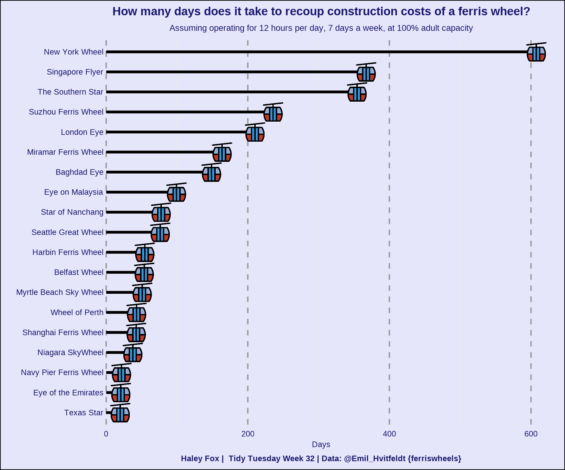
- Tidy Tuesday code to create a plot with data from {ferriswheels} showing the length of time required to recoup ferris wheel construction costs.

 Hi, I’m Haley. I’m a Data Scientist at the National Center for Ecological Analysis and Synthesis (NCEAS) located at UC Santa Barbara. Currently, I’m collaborating with an interdisciplinary team working to understand the environmental justice implications of global food trade. More broadly, I am interested in leveraging data to understand patterns and answer questions. I work towards achieving these objectives through data wrangling, statistical analyses, and data visualization primarily in the programming language R. In my spare time, you can find me at the beach running around with my dog Moose (she’s from Alaska). The beach is her favorite place and who could say no to that adorable face?